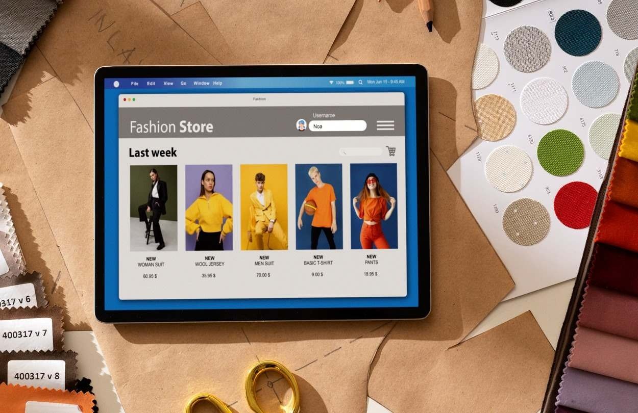
Your product page is where shoppers decide whether to buy. A strong page presents the product clearly and makes pricing easy to understand. From the title and images to reviews, delivery details, and the “Add to Cart” button, every e-commerce product page design element should help shoppers feel confident about their purchase. Clear product names, visible pricing, easy variant selection, reviews, and a prominent CTA are all core parts of a high-converting product page.
12 crucial ecommerce product page design elements
The following are crucial e-commerce product page design elements that help boost conversion. Let’s discuss further.
Clear, Benefit-Led Product Title
Your title should instantly tell shoppers what the product is and whether it matches their search. Include the product name and type, such as “Wireless Headphones” or “Leather Handbag.” You should also add useful details like brand, size, colour, material, and intended use. Keep the most important details in the first 60 to 70 characters. You should write for shoppers first, while still using relevant keywords naturally.
High-Quality Product Gallery
Since shoppers cannot touch or try the product, strong images can encourage them to purchase. You can start with a clear, high-resolution main image on a clean background. You can display multiple angles, including front, back, and sides. Further, add close-ups of key features. You can use lifestyle images to show the product in real life. Additionally, include scale references so shoppers can judge size. You should highlight important benefits or features with dedicated images. For example, a furniture store should show a piece of furniture from several angles, close-ups of the fabric, and its placement in a room.
Video or 360-Degree Product View
Images show what a product looks like. Video and 360-degree views show how it works, moves, or fits. Therefore, one of the crucial e-commerce product page design elements is to use short videos to demonstrate features or real-world use. You can add a 360-degree view for products where shape, finish, or construction matters. It is better to keep videos muted by default and let shoppers control playback. You should use clear thumbnails so visitors know what they are about to watch. Further, optimise media files so they do not slow down the page. For instance, a clothing brand might show how a garment moves when worn, while an electronics store could demonstrate controls and connectivity.
Scannable Product Description
A good description explains what the product is, why it matters, and whether it fits the shopper’s needs. You can start with a short overview of the product and who it is for. Further, explain the main benefits, not just the features. You can add specifications such as dimensions, materials, weight, and capacity. It is also better to include compatibility, usage instructions, and what is included. You can use bullets, headings, and short paragraphs to make details easy to scan. Detailed descriptions can help reduce uncertainty and unnecessary support questions.
Transparent Pricing and Discounts
One crucial e-commerce product page design element is to include pricing and offers. Shoppers should never have to guess what they ned to pay. You can display the current price clearly near the product title and CTA. Display the original price alongside a genuine discount. State the savings or discount percentage. Further, include unit pricing where relevant, such as price per kilogram or litre. You should mention whether taxes are included or added at the time of checkout. Additionally, make shipping, handling, and other fees visible early. Each product should highlight available payment options, including instalments where applicable.
Prominent Primary CTA
An essential aspect of e-commerce product page design is to use clear, familiar labels such as “Add to Cart” or “Buy Now.” Make the button stand out with strong colour contrast. You should keep it large enough to tap easily on mobile. Place it near the price, variants, and delivery information. Avoid competing buttons close to the main CTA. The page should display confirmation when an item is added to the cart. Clearly explain when a product is out of stock. A prominent, easily identifiable “Add to Cart” button is a core product-page best practice.
Variant Selection That Prevents Mistakes
If your product comes in different sizes, colours, or configurations, selecting the right one should be simple. In this regard, use visible buttons for sizes and common options. Show colour choices with swatches and text labels. You should clearly highlight the selected variant. Update the image, price, and availability when a shopper changes an option. The page should display stock status for each combination. You should also include size guides for clothing, footwear, and accessories. Further, disable unavailable combinations instead of letting shoppers select them.
Stock, Delivery, and Returns Information
Shoppers want to know whether the product is available, when it will arrive, and what happens if they change their mind. Hence, you need to display whether the item is in stock, low in stock, or unavailable. You should provide an estimated delivery date or delivery window. Further, display shipping costs or explain when shipping is free. You should also mention express, scheduled, or store-pickup options where available. Summarise the return period and any restrictions. It is better to include warranty details where relevant.
Social Proof – Ratings, Reviews, and UGC
Product reviews help shoppers trust the product before they buy. Hence, it is one of the crucial e-commerce product page design elements that you should not ignore. Every product should display the average star rating and total review count near the title. Further, highlight useful reviews about fit, quality, durability, or performance. You can add verified-purchase labels where possible. Additionally, you can include customer photos and videos. Let shoppers filter reviews by rating, fit, or product feature. You can create a Q&A section to answer common questions.
Trust Signals and Risk Reducers
Shoppers need to feel safe buying from you, especially if they are new to your brand. You need to display secure payment options and trust badges where relevant. Further, explain warranties, guarantees, and return policies. You should also highlight authenticity guarantees for branded or premium products. Display certifications only when they genuinely apply. Make customer support easy to find. Keep branding, policies, and product information consistent. The best trust signals depend on your product. Electronics shoppers may care most about warranty and support, while fashion shoppers may prioritiseprioritise sizing, returns, and real customer photos.
Mobile-First Layout and Performance
Many shoppers browse and buy on mobile. Therefore, you need to design your e-commerce product page for mobile first. Make images responsive and easy to zoom. You can use readable fonts, clear headings, and enough spacing. Keep variant buttons, price, and CTA easy to tap. Further, avoid hiding important details behind unnecessary taps or menus. Make reviews accessible without excessive scrolling. You should optimise images, scripts, and third-party apps for speed. Prevent layout shifts while the page loads. A page that looks great on desktop can still frustrate mobile shoppers if buttons are too small or key information is hard to find. Mobile product pages often create serious usability issues when important content is overlooked.
Cross-Sells, Related Products, and Navigation
Recommendations should help shoppers, not distract them from buying. You can display “Frequently Bought Together” products. Further, recommend useful accessories or add-ons. You can also display similar products for shoppers who want alternatives. Including recently viewed items for returning visitors is also a great idea. Use breadcrumbs to help shoppers navigate categories. You can place recommendations below the main product information, not beside the CTA.
A well-designed ecommerce product page is more than a collection of product images, descriptions, and purchase buttons. It is a carefully structured experience that helps customers understand a product, evaluate its value, overcome purchasing concerns, and complete an order with confidence. At Diligence Digital India, we can help design effective e-commerce product pages to boost sales conversion.