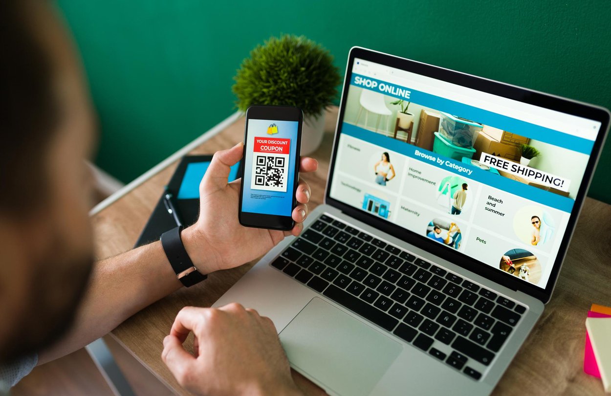

A landing page is a standalone page created to support a marketing or advertising campaign. It has a focused goal, such as signing up for a newsletter, booking a demo, making a purchase, or downloading a resource. Unlike a homepage, it should stay focused on one clear goal. A strong landing page combines clear messaging, useful visuals, easy navigation, and well-placed calls to action (CTAs). Every landing page design element should guide visitors toward completing that action.
Essential landing page design elements
The following are the essential design elements every landing page should have to improve conversion. Let’s discuss further.
Start with one clear goal
Before choosing colours, layouts, or copy, decide what you want the page to achieve. A lead-generation page will look different from a page designed to sell a product or encourage a software signup. In this regard, you need to identify the following –
- Target audience – Identify who will visit the page, their needs, challenges, interests, and expectations.
- Traffic source – Determine whether visitors are coming from Google Ads, social media campaigns, email marketing, organic search, or referral links.
- Desired action – Decide what you want visitors to do, such as requesting a quote, booking a consultation, purchasing a product, or downloading a resource.
Once the goal is clear, remove unnecessary navigation, competing offers, and unrelated content. Too many choices can distract visitors and make the next step unclear.
Include essential above – the – fold elements
It is one of the crucial landing page design elements. The above-the-fold section is what visitors see before scrolling. It should quickly explain what you offer, why it matters, and what they should do next. In this regard, you should include these four elements –
- Headline – Clearly state the main offer and its key benefit. Avoid vague or complicated wording.
- Subheadline – Add helpful context, explain who the offer is for, or highlight its main value.
- Hero visual – Use a relevant image, product photo, illustration, animation, or short demo video that supports the message. You should avoid using generic stock images.
- Primary CTA – Place a clear, prominent button above the fold, such as “Get a Free Quote,” “Book a Consultation,” or “Start Your Free Trial.”
Write benefit-driven copy
Effective landing page copy focuses on what the visitor gains, not just what your product or service includes. You should follow these copywriting best practices.
- Focus on outcomes – Explain how you solve a problem, save time, reduce costs, or improve results.
- Use short paragraphs – Keep paragraphs short and focus on one idea at a time.
- Include bullet points – Use bullet points to highlight key benefits, features, or offer details.
- Use descriptive headings – It will help visitors find the information they need quickly.
- Keep it concise – Give enough detail to support a decision without overwhelming the reader. The appropriate length depends on the audience and conversion goal.
Use a problem – solution – result framework
A simple way to structure your landing page is to show the visitor’s problem, your solution, and the result they can expect. For example:
- Problem – Your website looks outdated and is not generating enquiries.
- Solution – Get a professionally designed, mobile-friendly website tailored to your business.
- Result – Build a stronger online presence and make it easier for customers to contact you.
This makes it easier for your audience to understand the value of your offer.
Design a clear visual hierarchy
Visual hierarchy helps visitors notice what matters most and move naturally toward your CTA. Without a clear visual hierarchy, visitors may struggle to understand which information matters most. Implement the following landing page design best practices for effective visual hierarchy.
- Use appropriate typography – Make headlines larger and more prominent than supporting text.
- Use colour contrast – Highlight CTAs, headlines, and important details with contrasting colours.
- Leave enough whitespace – Space out sections, images, headings, and buttons so the page does not feel crowded.
- Place key elements strategically – Keep the headline, main message, hero visual, and primary CTA easy to find.
- Organise content into sections – Use clear sections for benefits, features, testimonials, FAQs, and the final CTA.
Avoid too many colours, animations, graphics, or competing elements that might drive attention away from the main goal.
Make the CTA impossible to miss
Your CTA tells visitors exactly what to do next. Even if the page looks good, visitors may leave if the next step is unclear. Use action-focused wording, such as:
- Get My Free Quote
- Schedule a Free Consultation
- Start My Free Trial
- Download the Free Guide
- Request a Product Demo
- Shop Now
The following landing page design practices can make the CTA easy to notice –
- Use contrasting colours – Choose a button colour that stands out while staying on brand.
- Make buttons large enough – Ensure they are easy to tap, especially on mobile.
- Add whitespace – Keep buttons separate from surrounding text and graphics.
- Repeat CTAs strategically – Place the primary CTA near the top, after key benefits, and near the bottom of the page.
Avoid excessive colours, decorative animations, unnecessary graphics, and competing visual elements that distract visitors from the primary goal.
Build trust with social proof
Visitors may hesitate if they are unfamiliar with your business. Social proof shows that other customers have had positive experiences and can make your offer more convincing. You may add the following –
- Customer testimonials – Use genuine feedback that explains specific benefits or experiences.
- Client logos – Show logos of recognisable companies you have worked with, with permission where needed.
- Ratings and reviews – Include current ratings from trusted review platforms.
- Case studies – Share real projects, challenges, solutions, and measurable results.
- User-generated content – For e-commerce, customer photos, reviews, and real experiences can build confidence.
You should place social proof near important decision points, such as just before a form or purchase CTA. You can also use specific details, such as customer names, photos, business details, and results, where possible, and always get permission before publishing identifiable information.
Reduce friction in landing page forms
Forms are often the final step before conversion. Hence, you should keep them simple to make it easier for visitors to fill them out. In this regard, implement the following landing page design best practices.
- Use clear field labels – Make it obvious what belongs in each field.
- Mark required fields – Clearly show which fields are mandatory and which are optional.
- Explain privacy – Add a short privacy note and link to your privacy policy where appropriate.
- Show progress for longer forms – Break longer forms into manageable steps and show a progress indicator.
- Provide clear validation – Explain missing or incorrect information clearly.
- Keep important forms visible – If the form is the main conversion action, place it near the top when practical.
For longer forms, test a multi-step layout to see whether it improves completion rates.
Answer customer objections with FAQs
Even interested visitors may have concerns before they convert. They may wonder about pricing, security, timelines, compatibility, refunds, or expected results. An FAQ section can address these questions directly on the page. Further, keep your answers short, accurate, and relevant. You should place important FAQs near the final CTA so visitors can resolve concerns before taking action.
Optimise the landing page for mobile and speed
Your landing page should work smoothly on desktops, tablets, and smartphones. A page that looks great on desktop but performs poorly on mobile can lose conversions. In this regard, implement the following best practices.
- Use responsive layouts – Ensure the page adjusts to different screen sizes without horizontal scrolling.
- Make text readable – Use clear fonts and enough spacing so visitors do not need to zoom in.
- Optimise buttons – Make CTAs easy to tap and leave enough space between interactive elements.
- Simplify navigation – Remove unnecessary menus and keep the main action easy to access.
- Optimise images – Compress images and use modern formats such as WebP or AVIF.
- Reduce unnecessary scripts – Limit third-party tools, heavy animations, and scripts that slow down loading.
- Use caching and reliable hosting – Browser caching, CDNs, and dependable hosting can improve performance.
Maintain brand consistency and message match
Your landing page should feel like a natural extension of the ad, email, or social post that brought the visitor there. If the ad promise doesn’t match the page offers, visitors may become confused or lose trust. Ensure that the language, offer, visuals, and messaging are consistent between the campaign and landing page. In this regard, implement the following landing page design best practices.
- Brand colours – Use your primary and secondary brand colours consistently.
- Typography – Keep fonts, heading styles, and formatting consistent.
- Logo placement – Make your logo easy to recognise.
- Visual style – Use images and design elements that match your brand.
- Brand voice – Keep the same tone across ads, headlines, descriptions, and CTAs.
- Offer consistency – Ensure the page delivers exactly what the ad, email, or social post promised.
Consistent branding reduces confusion and helps visitors feel confident about continuing.
Follow accessibility and usability best practices
Accessible design helps people with different abilities use your landing page, and it improves usability for everyone. In this regard, implement the following landing page design best practices.
- Use readable font sizes – Avoid overly small text, especially for instructions and form labels.
- Maintain sufficient colour contrast – WCAG recommends at least 4.5:1 contrast for normal text and 3:1 for large text.
- Add descriptive alt text – Use meaningful alt text for informative images.
- Support keyboard navigation – Ensure visitors can use links, buttons, and forms with a keyboard.
- Use descriptive form labels – Clearly label every field and identify required fields.
- Use proper heading structure – Organise content with logical heading levels.
Test, measure, and improve landing page performance
Launching the page is not the final step. Review how real visitors interact with it and use the data to improve results. In this regard, you can measure the following metrics –
- Conversion rate – It measures the percentage of visitors who complete the desired action.
- Form completion rate – It measures the percentage of visitors who successfully submit a form.
- Bounce rate – It measures the percentage of visitors who land on a page and leave without taking any action.
- Scroll depth – It measures how far visitors move down the page.
- CTA clicks – It measures the number of visitors who interact with CTA buttons.
- Page loading time – It measures how quickly the page becomes usable.
Conduct A/B Testing
A/B testing compares two versions of a landing page to see which performs better. Instead of guessing what visitors prefer, you can test different variations using real performance data.
You can consider testing the following elements:
- Headlines – Compare a service-focused headline with a benefit-driven one.
- Hero visuals – Test a product image against a demo video or custom illustration.
- Form length – See whether a shorter form increases completed submissions without reducing lead quality.
- Page layout – Compare different placements of testimonials, benefits, images, and CTAs.
- Button design – Test colours, sizes, and placements while keeping accessibility in mind.
Test one major variable at a time, keep traffic conditions comparable, and collect enough data before deciding which version performs better. Review results regularly and keep improving based on actual visitor behaviour.
A high-converting landing page requires a clear conversion goal, persuasive messaging, intuitive design, relevant social proof, simple forms, and a smooth user experience across devices. Every landing page design element should work together to help visitors understand the offer, trust the business, and complete the desired action. Diligence Digital India is a landing page design agency. You can hire our designers to create effective landing pages to boost conversions.